How Your Brand's Colors Tell a Story

Colors do more than just look pretty—they communicate emotions, set the mood, and tell a story. Whether you're drawn to vibrant reds or calming blues, the colors you choose for your brand play a big role in shaping how people feel when they encounter your business.
But how do you pick the right ones? It’s not just about choosing your favorite shades or grabbing a random palette from Pinterest. Let’s break down the psychology behind different colors and what they might be saying about your brand. Spoiler alert: the feelings each color evokes are far from random!
For real-world examples of how brands use color to tell their story, check out our Pinterest board links for branding inspiration by color!

Check out our Pinterest board for red branding inspiration!
Red: Bold & Stimulating
Red is a powerhouse color. It’s associated with everything from love and passion to energy and even urgency. Red can actually make people feel more physically stimulated—it’s a color that increases your heart rate and makes you pay attention. That’s why it’s a go-to for brands that want to make an impact.

Check out our Pinterest board for orange branding inspiration!
Orange: Creative & Invigorating
Orange is all about energy and transformation. It’s vibrant, playful, and feels like movement in color form. This shade often brings to mind creativity, optimism, and health, giving your brand an energetic and forward-thinking vibe.

Check out our Pinterest board for yellow branding inspiration!
Yellow: Happy & Uplifting
Yellow is like a burst of sunshine. It represents happiness, optimism, and warmth, making people feel good when they see it. Depending on the tone, it can be a lively, cheerful color, or it can take on a softer, more calming feel. Either way, it’s a color that radiates positivity.

Check out our Pinterest board for blue branding inspiration!
Blue: Dependable & Versatile
Blue is one of the most popular colors in the branding world, and it’s no surprise why. It’s a color of trust, calm, and dependability. But blue can take on so many different personalities. It can be regal and serious, or light and friendly, depending on the hue. It’s a safe bet when you want to convey professionalism or build trust.
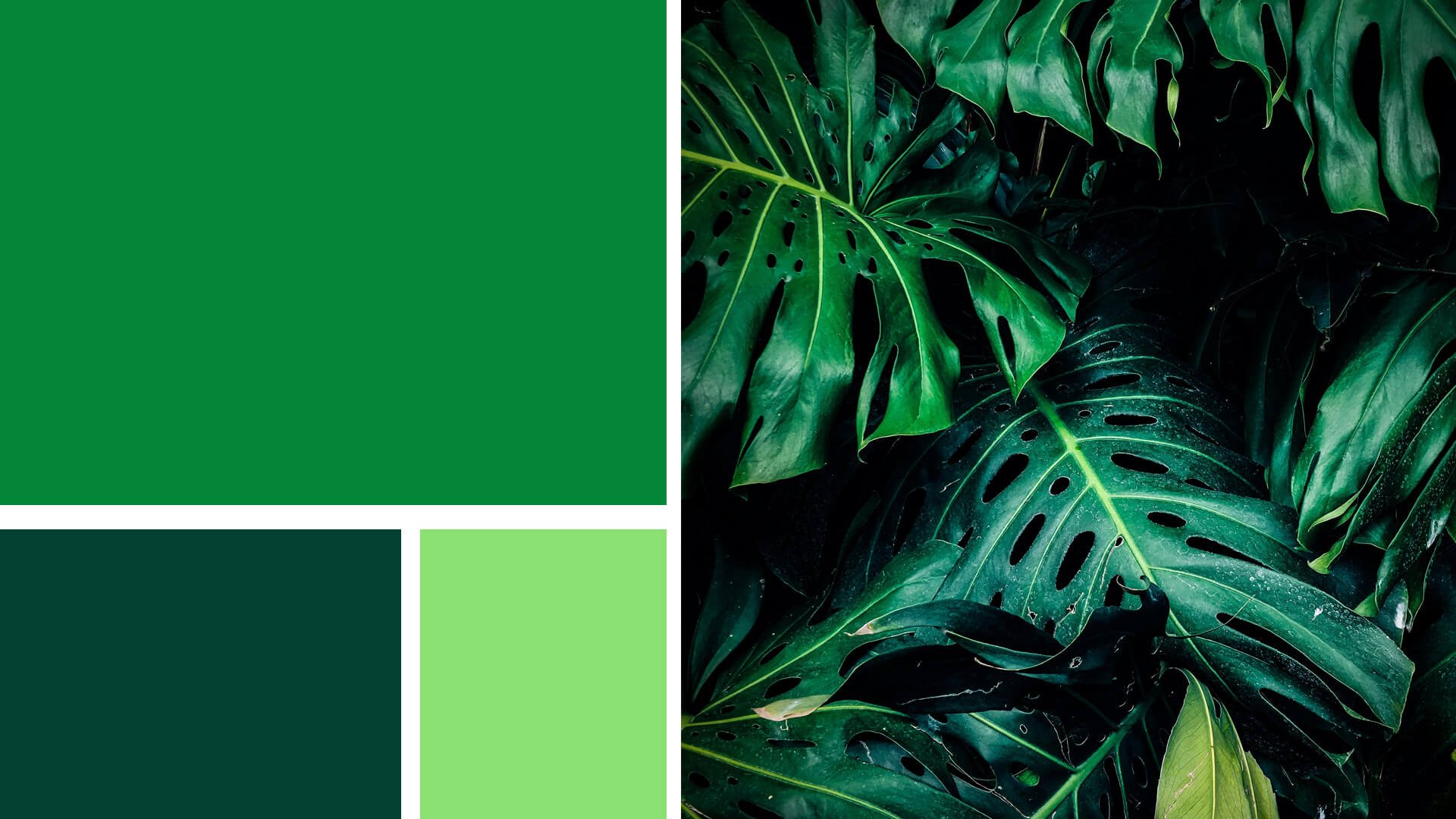
Check out our Pinterest board for green branding inspiration!
Green: Natural & Balanced
Green is the color of growth, renewal, and nature. It gives off feelings of balance and harmony, perfect for brands that want to evoke a sense of health, wellness, or sustainability. Whether light and fresh or deep and rich, green feels grounded and nurturing.

Check out our Pinterest board for purple branding inspiration!
Purple: Luxurious & Creative
Purple has long been associated with royalty and luxury. It’s the color of richness, creativity, and imagination. If you want to add a bit of sophistication or mystery to your brand, purple is the perfect choice.

Check out our Pinterest board for neutral branding inspiration!
Neutral Colors: Timeless & Sophisticated
Neutrals like black, white, and gray may seem simple, but they pack a punch when used well. These colors are all about sophistication and timelessness, providing balance and grounding to your design.

Check out our Pinterest board for black branding inspiration!
Black: Bold & Mysterious
Black is powerful. It’s strong, classic, and a bit mysterious. Whether used as a primary color or an accent, black brings an air of sophistication and boldness. It can be edgy and rebellious or sleek and elegant, depending on how you use it.

Check out our Pinterest board for white branding inspiration!
White: Clean & Simple
White represents purity, simplicity, and cleanliness. It’s the ultimate blank canvas, providing clarity and space in a design. Whether used on its own or in combination with other colors, white helps balance out more vibrant shades and creates a sense of openness.

Check out our Pinterest board for gray branding inspiration!
Gray: Balanced & Neutral
Gray is the perfect middle ground between black and white. It’s calming, neutral, and a little moody. Gray often carries an air of sophistication without being as bold as black, making it a subtle yet strong choice.
Choosing the Right Colors for Your Brand
When picking colors for your brand, it’s all about understanding what message you want to send. Every color evokes a different emotion, and combining the right shades can create a strong and lasting impression. So, as fun as it might be to pick your favorite color, remember that your palette is telling a story—make sure it’s the one you want your audience to hear!
Tips for Using Color in Your Branding:
Mix warm and cool tones: Combining different color temperatures can create balance and draw attention to the right places in your design.
Start with one main color: Focus on selecting a dominant color that reflects your brand’s core personality, and build your palette around it.
Don’t forget neutrals: Neutrals help to balance and ground your color palette, providing structure and sophistication.
By using color thoughtfully, you’ll create a brand identity that’s both visually appealing and emotionally resonant.

Ready to bring your brand to life with the perfect color palette?
Our Pick and Play process makes it easy to get a custom logo that speaks to your style and vision. Choose your colors, and we’ll handle the rest! Let’s create something amazing together.