Choosing the Right Logo Layout for Your Brand
Logos come in many shapes and styles, but most fit into one of four primary layouts: Wordmarks, Icons, Combination Marks, and Emblems.
Each layout offers something unique for your brand. Whether you're looking for simplicity, versatility, or something more artistic, there's a logo layout that will fit your needs. In this guide, we'll walk you through these layouts to help you decide which might be the best for your brand—even if you’re new to the world of design.
Check out our Pinterest board for more inspiration!
Wordmark
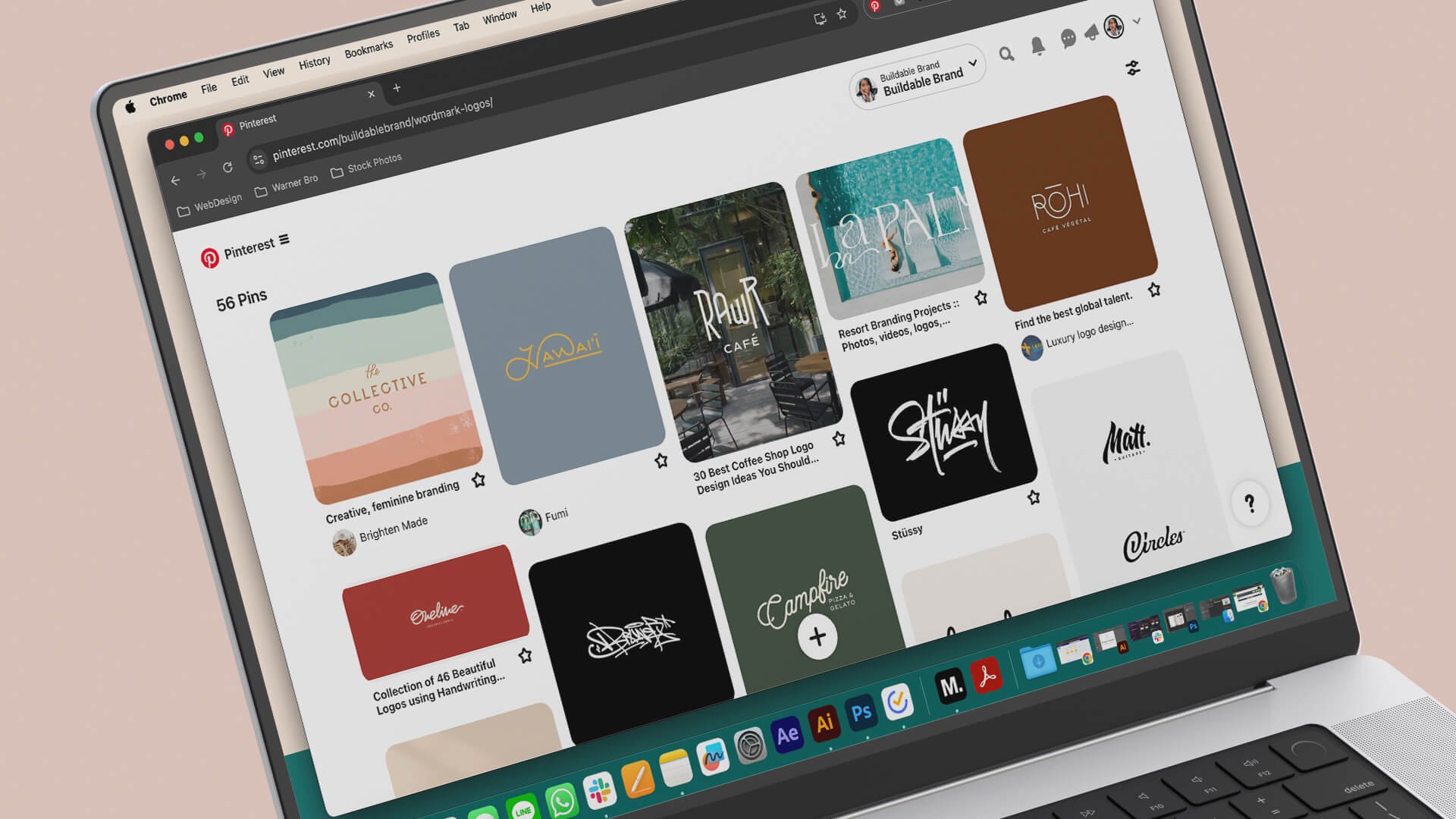
A wordmark is a logo that’s built entirely around your brand’s name. This layout focuses on typography to make a statement. From simplistic and clean to unique and bold, wordmarks create strong recognition and give your brand a professional look, all while making your brand’s name the star.
I love creating wordmarks because they let typography shine. You can make amazing designs using creative layouts and font styles that prove less is more!
Tips for Successful Wordmark Logos:
Choose your fonts wisely, as they set the tone for the overall vibe of the design. A logo can feel sleek and modern or youthful and fun, depending on the font.
Remember, simple doesn’t have to mean boring. Creative layouts, interesting fonts, or pairing two fonts together can elevate your design.
Take the length of your brand name into account when choosing this style.
Check out our Pinterest board for more inspiration!
Icons
Icons can range from simple symbols to illustrations or even monograms (using initials instead of full names). These logos are versatile and represent your brand visually without relying on text. However, your audience will need to connect your symbol to your brand name, so it's important to create something memorable.
Icons are always exciting because they leave plenty of room for creativity. Whether it’s a sleek, modern design or one with hidden imagery, this style allows you to tell a visual story without saying a word.
Tips for Successful Icon Logos:
Make sure your design is distinctive and memorable to leave a lasting impression.
Consider using clever, hidden design elements to create something unique.
Be creative with your icon to ensure it represents your brand’s story effectively.
Check out our Pinterest board for more inspiration!
Combination Marks
Combination marks feature both text and an icon, giving you the flexibility to use either element on its own or together as a cohesive design. This is a popular choice for brands that want versatility without creating entirely different logo variations.
While combo marks are popular, I encourage clients not to pick this option “just because.” A clear vision and creative idea are crucial to pairing the wordmark and icon for a cohesive design.
Tips for Successful Combo Marks:
Ensure the text and icon work harmoniously, creating a balanced design.
Consider how and where your logo will be used, whether for signage, digital platforms, or print.
Keep consistency—separating the icon and wordmark should be done intentionally and only when it benefits your branding.
Check out our Pinterest board for more inspiration!
Emblems and Badges
Emblems and badges combine text and sometimes icons within a containing shape, whether explicitly drawn or implied. This layout works well for brands that want to include additional text outside of their name and can vary from vintage to modern designs.
Emblems are some of my favorite layouts because they allow creativity to really shine. From bold, artistic designs to simple, classic shapes, these logos can be some of the most visually engaging.
Tips for Successful Emblem/Badge Logos:
Make sure your emblem is clear and recognizable, even when scaled down.
While you can add more elements to this style, avoid cluttering the design.
Get creative—emblems don’t have to be vintage or enclosed. Experiment with negative space, unique shapes, and typography.
There isn’t one “right” choice when selecting a logo layout. The key is to choose a style that aligns with your brand’s personality and attracts your audience. Every layout, from wordmarks to emblems, can be made modern, sophisticated, trendy, or timeless, depending on the design.
The most important thing is to pick a layout that meets your needs. For example, if your brand focuses on an app, an icon may suit you better than a wordmark. If you want your restaurant sign to stand out, a bold wordmark might be your best bet.
Understanding your brand’s needs will help you make a stronger visual impact. Whether you're tackling the design yourself or working with a professional designer to bring your vision to life, choosing the right logo layout is the first step toward building a memorable brand.
Interested in a Logo Design?
Our simple and easy Pick and Play process is designed to get you a custom, professional logo that elevates your brand—fast! Choose your layout, colors, and style, and we'll handle the rest, delivering a designer-quality logo that perfectly fits your vision. Get started today and upgrade your brand with confidence!


