Why a Mobile-Friendly Website is a MUST!
In today’s world, most people use their phones to browse the internet. If your website doesn’t look good or work well on a smartphone, you could be losing customers without even knowing it. That’s why having a mobile-friendly website is so important—no matter what type of business you have.
Why Mobile Optimization Matters
Most People Use Their Phones
More than half of all internet traffic comes from mobile devices like smartphones and tablets. If your website isn’t easy to use on these devices, you’re missing out on a big chunk of potential customers.
Good User Experience = Happy Customers
Think about it: If you visit a website on your phone and it’s hard to read or navigate, you’ll probably leave and look for another one. A mobile-friendly website ensures that your visitors can easily browse and find what they need, leading to better satisfaction and more business for you.Google Rewards Mobile-Friendly Sites
Google favors websites that work well on mobile devices. This means that if your site isn’t mobile-friendly, it might not show up as high in search results, making it harder for people to find you online.More Conversions, More Sales
A mobile-friendly site can lead to more people taking action—whether that’s making a purchase, signing up for a newsletter, or contacting you for more information. The easier it is for visitors to use your site, the more likely they are to become customers.

Simple Tips to Make Your Site Mobile-Friendly
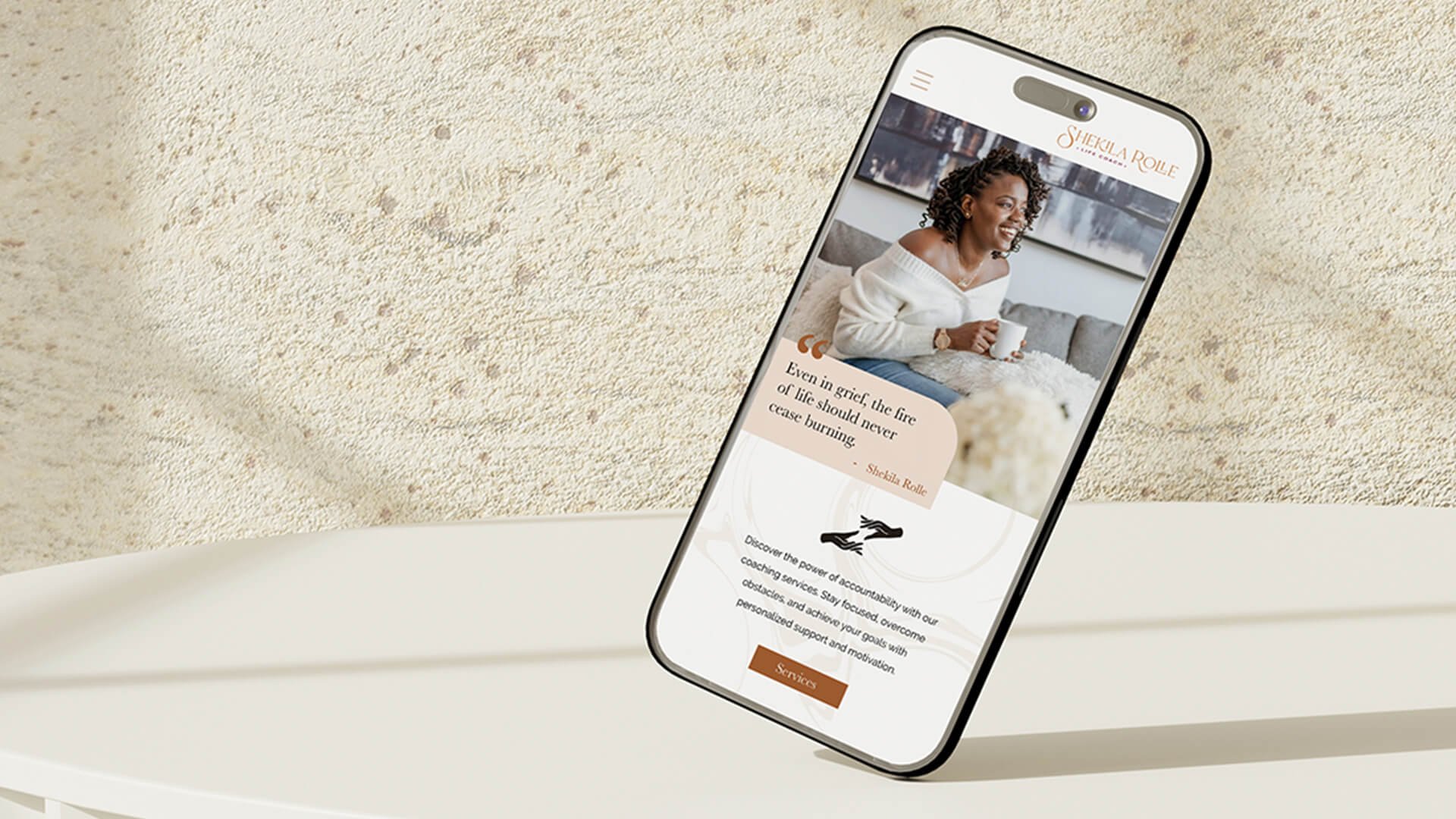
Use a Responsive Design
A responsive design automatically adjusts your website to look good on any device, whether it’s a desktop or a smartphone. Most website builders like Squarespace or WordPress offer responsive templates, so you don’t need to worry about the technical details.Keep Navigation Simple
Make it easy for visitors to find what they’re looking for with clear menus and simple navigation. On mobile, less is more—so avoid cluttering your site with too many options.Optimize Images
Large images can slow down your site, especially on mobile. Make sure your images are the right size and load quickly, so visitors don’t get frustrated and leave.Choose Easy-to-Read Fonts
Your text should be large enough to read easily on a small screen. Avoid using fancy fonts that are hard to read, and keep your content concise and clear.Test Your Site on Different Devices
Before you launch or update your website, check how it looks on various devices. This ensures everything works properly and looks good, no matter what device your visitors use.

In a nutshell…
Having a mobile-friendly website is essential for reaching and keeping your customers. It makes your site easier to use, improves your visibility on search engines, and ultimately leads to more business. If you’re ready to make sure your website looks great on all devices, we’re here to help. Reach out to us, and let’s get started on making your site mobile-friendly!